Today, I want to talk a little about the new cover and the new interior design of “Dorelle’s Journey”.
You see, I liked the original cover. I wasn’t that thrilled with the interior graphics, but the whole book looked nice and cool with all of the chapter headers and break graphics. I had hired people to do that for me, and I got what I paid for.
I still don’t regret that choice. I made it from where I was then, and it was okay. It was the best I could do then.
But there were hints that maybe the cover and design weren’t as good as they could have been. That maybe they didn’t quite fit the story.
You see, I got one review on a big, influential review site where the reviewer thought my characters were young teenagers. Granted, part of that was because the site categorized my story as “children’s” since it doesn’t contain much swearing or sex.
Young teenagers. Soldiers. Commanders. Fighters. Really?
It totally shocked me. My books are fantasy adventures, the series does move on to contain some sex and mild swearing (I invented new swear words), and it certainly wasn’t intended for children. And Dorelle is in her mid-twenties, and Ferren, her Wing Commander is in his mid-thirties, at least in my imagination.
And I started to wonder why someone would have that impression (aside from reading the Hunger Games…). Seriously. Teenagers? Kid Lit? My tale?
Enter the cover and the cute, swirly interior graphics.
Stuff you find in children’s books.
And you don’t find these things in serious, epic or classic fantasy for adults. In fact, the cover was just too sweet, as well. No real drama. Nothing to draw a reader in, despite the mysterious castle and the swooping dragons. I did like the sailing ship because it does show up in the story. But there just isn’t much drama with that bland background.
Now, in the meantime, designing an ebook or the interior of a print book has become much, much easier with the advent of Jutoh and reasonable CreateSpace templates. And let me mention the integrated PDF function of LibreOffice, which makes it even easier. Yes, it embeds the fonts you’re using. Yes, CreateSpace is happy with the PDF.
When I found someone to create new covers, the decision was clear.
The entire dragon series would get a facelift.
I wrote about that about a month ago. The facelift is practically done, and I’m working hard to get the fourth and final part of the series ready for publication.
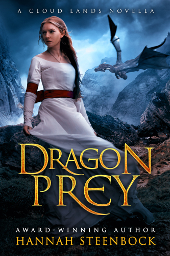
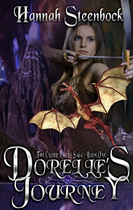
Over the course of a few days, Ashley, my cover designer, and I put together the new cover for “Dorelle’s Journey”. I scoured Shutterstock for a picture of an archer who fit my sense of Dorelle – a clear-headed, no-nonsense, dragon-loving independet fighter. Ashley offered a cute, pouty girl, a fairy-type archer, and I just couldn’t see her as Dorelle. “My” Dorelle isn’t cute. She’s tough and does what she has to do.
So I picked the archer who is now on the cover (not that there was much choice, mind you). Ashely removed the ugly orange glove she’s wearing in the original, but the bow is still a tad too modern (like I said, little choice so this is a compromise). And I think Ashley created a fantastic atmosphere of drama and tension for the cover, including that dragon winging across it. I’m still fascinated by the complex background, too.
Now, I also picked the font myself, and it will be the signature font for Hannah Steenbock (love how that name comes out in it!). Yet I’m not entirely happy with the all-caps title since the swirly capital letters don’t work that well in all-caps. For now, however, it’ll stand. And Ashley did an amazing silver effect on the letters that I utterly love.
So here I proudly present the new cover for Dorelle’s Journey:
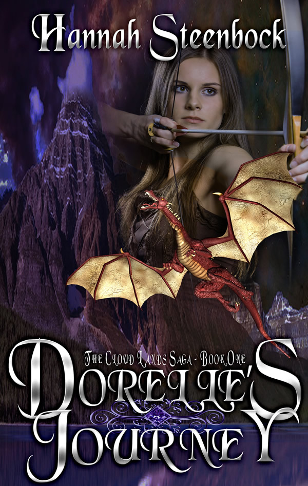
“Dorelle’s Journey”
I did all the work on the ebook and the print interior myself. And of course, with print, you want a clean, readable font and no nonsense. For an ebook, choices are even less, since most eReaders pick a font for you. Basically, with an ebook, you can choose either serif or non-serif, and that’s about it.
So the ebook is plain Times New Roman. Very simple. Nothing to take attention away from the story itself. No graphics that blow up file size…
And for the print, I used the title font for the chapter headers, and plain, old boring Times New Roman for the text. The Chapter Headers are the only fancy stuff in it. Here’s a pic:
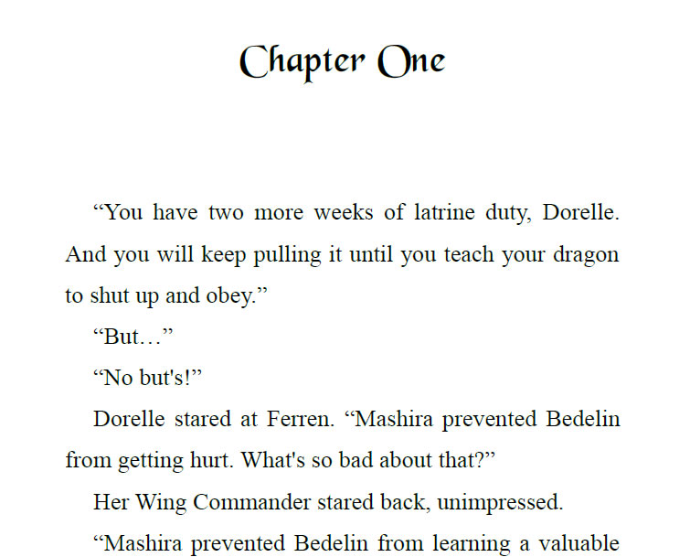
Chapter Header of the print version
And that’s how I like it. Simple, a little elegant, and definitely Fantasy.
So that’s what I’ve been up to with my dragon books. I hope you’ll get interested enough to check them out.
Here’s a link that’ll take you to your Amazon store: “Dorelle’s Journey”. And if you have read and enjoyed the tale – let me know! Any questions, too! (Same goes for any typos, errors and mistakes, of course.)
I’m looking forward to your comments.

