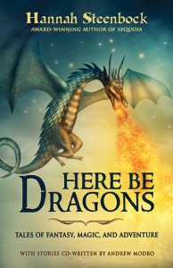
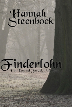
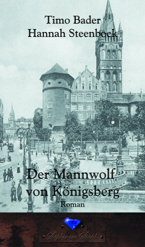
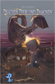
The cover is gorgeous, but there is even more beauty inside the book – yes, even the ebook. That’s why I work with Blue Harvest Creative, the formatting company I found last year. I think they make the prettiest ebooks I’ve ever seen. They look just like print versions.
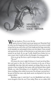
Anyway, this is how the first page of every story looks – with a different title, of course, but with the same awesome picture on the page. Yes, even in the ebook.
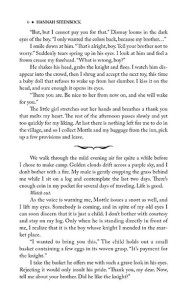
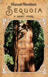
And when there are breaks in a story, there are also little pictures to indicate those. BHC chooses different pictures to fit each book. “Sequoia” has bear prints, “Pu-ukani’s Song” has a wavy, watery image and “Here Be Dragons” has this:
And if you look closely, you can see the same divider image just below the title on the cover itself. I’ll repeat that here because it is so glorious. It looks totally stunning on the print book, especially in matte. So glad CreateSpace now offers that option.
And other than usual, you can click on these pictures to enlarge them – just to really enjoy that eye candy.
Big shoutout to Blue Harvest Creative for making my book so beautiful.
PS: Want to buy “Here Be Dragons”? Here you go:
Amazon.com
Amazon.co.uk
Amazon.de
If you prefer to order from your local bookstore, you can! Just use this
ISBN: 978-1500188023, and they will find it for you.
Want to say something? Feel free to comment.






Thanks so much, Hannah! We loved designing this book for you 🙂