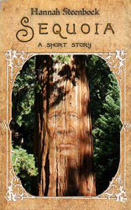
I need to brag a little. Because I created something I’m quite proud of. And it wasn’t easy.
Well, it wasn’t really hard, either, just a bit complicated.
You see, I wanted to create an add for “Dorelle’s Journey”. My little book needs a bit of love, and I wanted something nice to post on social media. Something I can reuse, rather than a specific release or sale ad.
Here are the steps:
1. Background
I created the background with PicMonkey. That’s because I love their filters and extras, even the free ones. I made it 800×800 because that should work with most social media.
(Yes, I know, I probably should create pics in perfect size because resizing always introduces imperfections, but … I’m really not good with graphics. And I’m perfectionist. Not a good combo!)
I picked a color from the book cover, or as close as I could make it, and then played with the water filter of PicMonkey.
Here’s the result:

Background
I saved it as such, and in a smaller version especially for FB so I could play with it. I’m trying to save every stage, giving me more options.
2. Cover
Then I took my cover image and added it to the background. Nothing special here, just resizing the file to fit. I may play with the sizes, but I really don’t want the cover to totally dominate the entire pic. It should be big enough for people to recognize it when they see it on Amazon – and big enough so they can read the title!
I did this in Fireworks, which is a very old Macromedia graphics program. I use it because somehow, it works best for my intuitive approach to computer work. Yes, it’s severely outdated. I don’t care. I *own* it.
So here are background and cover together:

Background and cover
Again, I saved it in this stage, because I know I’ll want to create different versions with different text in it. (The original is bigger than shown here.)
3. Text (Fireworks)
This step proved to be difficult. I added the text in my old, faithful Fireworks, and no matter what I did, it came out horribly pixely. Which I can’t explain since text is part of the vector stuff even Fireworks does. It may have happened because it didn’t like working with a jpg as background image…
Here’s a result. Yes, I’m showing it to you because it’s part of the process. (*shudder*)

First try with added text.
The result of exporting it to jpg was gruesome. Notice the white line around the cover? And the pixels on the text? The distortion around the text? Yeah. Imagine that in full size on FB. Dreadful.
Did I mention I’m a perfectionist?
I gave up on that.
4. Text (GIMP)
Today, I felt relaxed enough for another go at GIMP. It’s a cool program, free, open-source and originally Linux based. Its name means “GNU Image Manipulation Program”, after all.
Loading the background image with the cover was easy peasy. Clicking on the text tool and adding the first paragraph, ditto. Then I tried to move the text field.
ARGH!
I’m used to a tool where you can grab an element and just drag it around in your image. I knew GIMP should have something like it. And yeah, it does. But every time I tried to grab the text and pull it around, GIMP moved my background instead.
I learned, eventually. And I did so without screaming, hitting my desk or gnashing my teeth. (*shoulderpats*) Of course, before I figured that out, I moved the borders of the text element for repositioning. Gah.
And GIMP is a bit clunky (might be my old version) when it comes to choosing a font. Basically, you have to know what you have and want, and type the name of the font into the tool box. No drop down menu. So I chose Bauhaus – which is a font I love, but it’s not necessarily suited for the pic. And there still is some distortion around the text. But it’s what I have for now. And I can live with it.
Without further ado, here’s the final version:

Final version (for now!)
Your Turn:
Thanks for reading! This one has been long.
I’ll definitely play some more with the text, both content and format. But I’d be grateful for comments, suggestions, and even tricks for handling GIMP. Because this is just the start.
So please comment.
Thank you.

